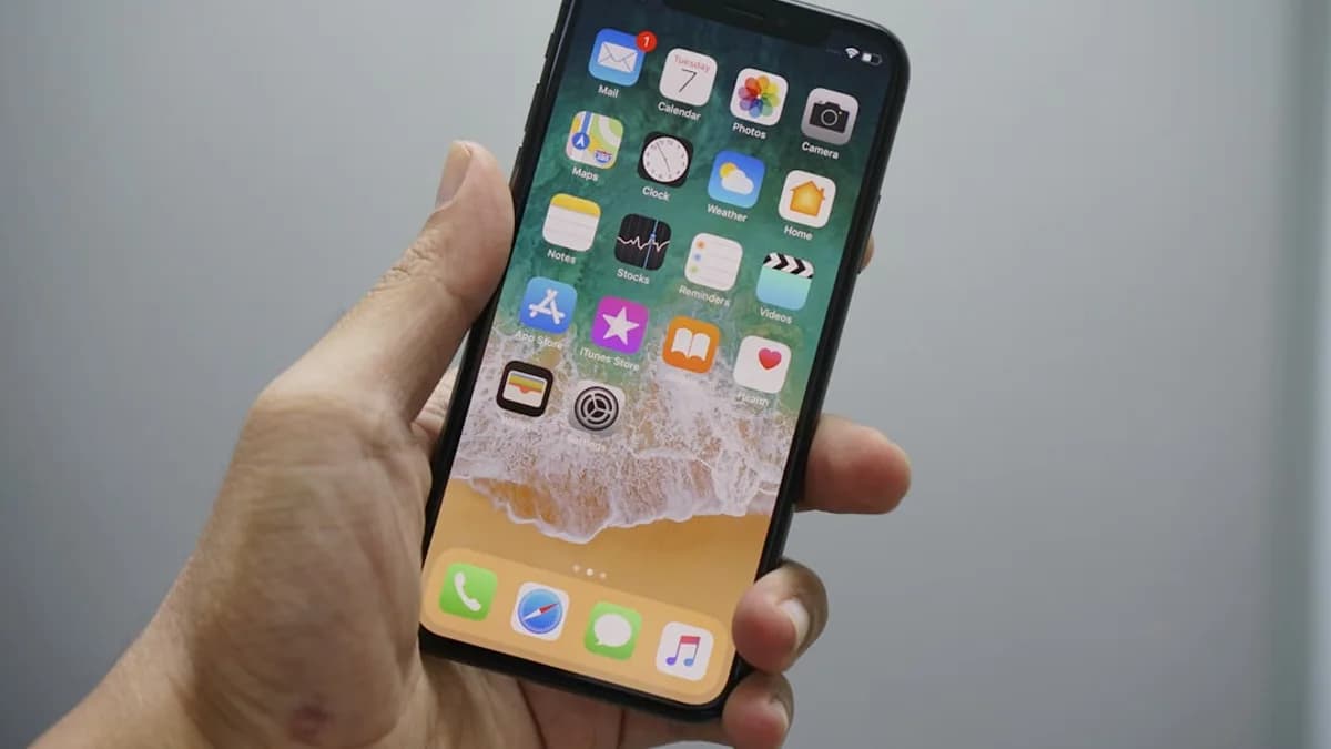
Apple is making Siri AI important enough to displace a 15-year iPhone and iPad reflex, and that is the wrong trade. The change is technically conditional, but emotionally bigger: once users enable Siri AI in iOS 27 or iPadOS 27, swiping down from the center of the top edge no longer opens Notification Center; it invokes Apple’s new AI experience instead, according to 9to5Mac .
That matters because Notification Center is not just another panel. Since iOS 5 in 2011, it has been part of the operating system’s navigation grammar: swipe, check alerts, move on. Apple can argue the old behavior still exists from the top-left corner. True. But shifting a core gesture to make room for AI tells users something sharper: the interface they learned is negotiable when Apple wants to promote a new system layer.
Apple’s Notification Center gesture change puts Siri AI above predictability
By default, Notification Center access is unchanged in iOS 27 and iPadOS 27. The break happens after Siri AI is enabled. At that point, one way to summon Siri AI is swiping down from the center of the top edge of the display — the same area many users have associated with notifications for years.
The replacement is not total. Users can still open Notification Center by swiping down from the top-left corner. But 9to5Mac’s core observation is that Apple is giving “the majority of the top edge” to Siri AI, leaving notifications pushed into a smaller, more specific target.
“Now it’s Notification Center’s turn to be put in the corner.”
That line captures the issue. Apple is not removing alerts. It is demoting their most familiar doorway. For a company that built its reputation on making complex devices feel obvious, that is a meaningful design choice.
Readers following the broader iOS 27 interface debate will recognize the pattern. Apple is not merely adding Siri AI; it is rearranging long-standing surfaces around it. That same tension shows up in our coverage of iOS 27 reopening Apple’s iPhone icon fight, iOS 27 fixing the AirPods settings mess users hate most, Golden Gate expanding iPhone Mirroring, iOS 27 Apple Weather features, iOS 27 Beats firmware fix, and iPhone 18 Pro camera controls: small interface decisions can carry more weight than feature lists.
Notification Center worked because the mental model stayed simple
Notification Center became useful because it answered one question cleanly: where did my alerts go? Since 2011, iPhone and iPad users have had a central place to scan app notifications in chronological order. That sounds mundane. It is not.
A phone’s notification system is the daily inbox of the operating system. Messages, app alerts, reminders, missed activity — they all collapse into one place. The user does not need to remember which app did what first. The system preserves the trail.
The gesture reinforced that model. Pull down from the top, see what happened. It was physical, repeatable, and easy to explain. Even users who did not consciously think about “Notification Center” learned the movement as part of using the device.
Apple’s best interface ideas often work that way. They become invisible. The user does not admire the UI; the user stops noticing it. That is why moving a familiar system action matters more than moving a button inside an app.
A system gesture is not ordinary UI; it becomes muscle memory
A gesture is different from a menu item. Menu items are read. Gestures are performed before the user has formed a sentence in their head. That is why changing one can make a device feel subtly wrong even when the new design is logical on paper.
The likely friction is easy to imagine without exaggerating it: a user swipes down to check alerts and gets Siri AI instead. Another user reaches for the top-left corner and misses. Someone else slows down because they now need to think about which part of the top edge they touched.
This does not mean every user will suffer. The 9to5Mac comment section already shows a split. One top comment says:
“I’ve been always swiping from the left corner to see my notifications. I didn’t even know you could swipe from the center to get to it as well 😂 I guess I’m good then?”
That is the strongest defense of Apple’s move. For users who already swipe from the left, nothing important changes. For users who invoke Notification Center from the center, the change lands directly on a learned reflex.
Here is the practical contrast:
| State | Center top-edge swipe | Top-left swipe | User effect |
|---|---|---|---|
| iOS 27 default | Opens Notification Center | Opens Notification Center | Existing behavior remains |
| Siri AI enabled | Invokes Siri AI | Opens Notification Center | Notifications move to a narrower entry point |
Apple can say it preserved access. The better question is whether it preserved confidence.
iPad users get the messier version of the trade
The iPad case looks more awkward. 9to5Mac notes that on iPad, “the area above Home screen app icons is pretty much devoted to invoking Siri AI.” It also says the area for opening Notification Center can shrink if users disable displaying AM/PM or the date.
That is a strange place for iPadOS to be. The iPad already asks users to juggle touch, keyboard behavior, multitasking, and app windows in ways the iPhone usually does not. Its productivity identity depends on reducing confusion, not adding more precision targets at the top edge.
This is where Apple’s AI push risks colliding with Apple’s platform discipline. If Siri AI is meant to become a central layer across devices, it needs easy access. But if gaining that access makes the iPad’s basic alert gesture feel less reliable, the win is narrower than Apple may think.
The iPad needs fewer “wait, which gesture was that?” moments. Not more.
Apple had softer ways to introduce the same Siri AI shortcut
Innovation does not require erasing the old entry point on day one. Apple could have made this transition less abrupt while still giving Siri AI prime placement.
Reasonable options include:
- Transition control: Let users keep the old Notification Center gesture while testing Siri AI elsewhere.
- Legacy mode: Offer a temporary setting for users who rely on the center top-edge swipe.
- Onboarding: Explain clearly, the first time Siri AI is enabled, that Notification Center has moved to the top-left corner.
- Hybrid behavior: Use a short hold, second swipe, or visible cue to distinguish Siri AI from notifications.
None of these ideas require Apple to back away from Siri AI. They require Apple to respect habit as part of design. The best interface changes feel inevitable after a week. The worst feel imposed even after users understand them.
This distinction also matters because iOS 27 is not just an AI release. Apple’s own preview frames Siri AI as a major new assistant layer with natural conversation, personal context, app actions, a dedicated Siri app, Camera integration, writing tools, and more. If Apple wants users to trust that layer, the first interaction should not feel like it stole a gesture.
The strongest case for Apple: old gestures can block new systems
Apple’s defenders have a fair argument. A 15-year-old gesture map cannot be treated as sacred forever. New AI interfaces may need systemwide access. The old Siri button and voice-first model may not be enough for a conversational assistant that users can type to, revisit, and carry across devices.
There is also precedent for major gesture reshuffling. 9to5Mac points back to the iPhone X era, when Control Center moved from a bottom swipe to a top-right corner swipe. Apple later unified that experience across devices. Users complained, adapted, and the new pattern became normal.
That history is the best argument that Apple may be right again. Early feedback around Apple’s new Siri AI system, 9to5Mac says, sounds “overwhelmingly positive.” If Siri AI becomes genuinely useful, many users may accept the trade.
But this counterargument has a limit. Control Center moved during a larger physical and interface transition. This change is tied to enabling an AI feature. That makes the gesture shift feel less like a necessary system redesign and more like prioritizing Apple’s new marquee layer over a daily utility.
Trust in iOS 27 depends on treating muscle memory as a contract
Apple should not treat long-standing system gestures as disposable real estate. Notification Center has been stable since iOS 5, and stability is part of why users trust it. The fact that the old behavior remains by default helps, but it does not solve the problem for anyone who enables Siri AI and suddenly finds a familiar swipe doing something else.
The right path is not to freeze iOS in 2011. It is to make change legible. Apple should explain the gesture shift clearly, preserve transition options where possible, and pay special attention to iPad users who may face a smaller target for notifications depending on their status display choices.
For readers tracking the quieter side of iOS 27, this is also why small system tweaks deserve scrutiny; our piece on tiny iPhone fixes revealing iOS 27’s Siri safety net fits the same theme. The success of Apple’s AI push will not be judged only by demos. It will be judged by whether the phone still feels like itself.
The iPhone feels best when it disappears into habit. If iOS 27 makes users think twice before checking an alert, Apple has solved one Siri problem by creating a smaller but more personal one.
Impact Analysis
- Apple is changing a gesture users have relied on since iOS 5 in 2011.
- The move signals that Siri AI is becoming a core interface layer, not just an optional assistant.
- Shifting Notification Center to a smaller target could make everyday iPhone and iPad navigation feel less predictable.