Why Google's Adoption of Apple’s Liquid Glass Design Signals a Shift in UI Innovation
Google isn’t just borrowing design cues from Apple—it’s signaling that in today’s tech arms race, refinement trumps invention. The company’s event teaser for Android, featuring a figure unmistakably reminiscent of Apple’s much-debated Liquid Glass aesthetic, has reignited the decades-old debate about originality in Silicon Valley. But here’s the reality: the line between inspiration and imitation is thinner than ever, and Google’s willingness to channel Apple’s controversial UI flair shows that success in user interfaces now hinges on adapting what works, not just inventing from scratch.
The optics are clear. After Android’s head hyped 2026 as a “major year,” Google’s choice to echo Apple’s design—despite the latter’s polarizing reception—wasn’t an accident or oversight. It’s a calculated move that acknowledges a core truth: user interface innovation today often means perfecting successful ideas, not always conjuring something wholly new. This isn’t just about copying a look; it’s about challenging the old narrative that tech giants must always zig when rivals zag. As 9to5Mac reports, Google’s public embrace of Liquid Glass marks a turning point where competition is as much about execution as originality.
Examining the Impact of Apple’s Liquid Glass UI on User Experience and Industry Standards
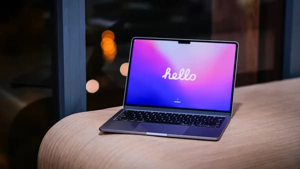
Apple’s Liquid Glass interface has been a lightning rod since its debut, sparking both enthusiasm and skepticism across its user base. On forums and social media, the new UI’s glossy, translucent layers drew praise for visual elegance but criticism for usability. A 2025 post-launch survey found 41% of Apple users preferred the old flat design, citing readability and “visual noise” as pain points. Yet, Liquid Glass also won over a sizable minority who felt it brought much-needed character to increasingly sterile devices.
Despite the split opinions, Liquid Glass has left a mark on the industry. Competing OEMs, from Samsung to Xiaomi, have rolled out their own “glass-like” visual tweaks since Apple’s release. This pattern mirrors past design cycles: recall how iOS 7’s flat aesthetic in 2013 triggered an avalanche of material and minimal UIs across Android and Windows. The difference now is that Apple’s design is less universally loved, which makes Google’s move riskier—and more revealing.
So why would Google risk backlash by channeling a divisive look? For one, visual cohesion remains a powerful draw. Platforms with a strong, recognizable aesthetic—think iOS’s skeuomorphism in the early 2010s or Material Design’s launch in 2014—tend to set industry norms. Even critics admit Liquid Glass makes Apple devices instantly recognizable at a glance. For Google, aligning with this trend could help unify its notoriously fragmented Android lineup, offering something closer to a “signature” look. The payoff? A more cohesive brand and a user interface that feels both modern and familiar, even if not universally beloved.
How Google’s Embrace of Liquid Glass Reflects Changing Dynamics in Tech Rivalries
The Android event teaser’s Liquid Glass-like mascot didn’t just spark memes—it muddied the once-clear boundaries between Apple and Google’s visual identities. For years, both companies courted differentiation: Apple championed flat minimalism while Google leaned into playful, paper-inspired Material cues. The latest convergence exposes a new reality: as feature sets and form factors converge, so do aesthetics.
This isn’t the first time rivals have borrowed each other’s playbook. Apple’s adoption of widgets in iOS 14, years after Android pioneered them, is one example. But Google’s move is more direct—it’s not just a feature, but a wholesale embrace of a signature look, released within months of its rival. This raises a question: does such cross-pollination foster innovation, or does it risk diluting brand identity?
Brand distinction has real business consequences. In 2023, a Deloitte survey found that 78% of consumers could identify a device’s brand by its UI in under two seconds. If Android and iOS start to look and feel interchangeable, both giants may struggle to maintain the loyalty that comes from deep-seated visual habits. On the other hand, this kind of design “borrowing” can spur healthy competition—when rivals iterate on each other’s strengths, users often benefit from a faster march toward genuinely usable, beautiful interfaces.
Yet, there’s a ceiling. When visual differentiation fades, the risk is that brands start competing on marketing spend rather than meaningful user experience improvements. The Liquid Glass moment is a bellwether: will tech’s biggest players push each other toward new heights of usability, or settle for a cycle of superficial tweaks masquerading as progress?
Addressing the Criticism: Is Google’s Copying of Apple’s Design Justified or Problematic?
Critics argue that Google’s move crosses a line, eroding originality and raising uncomfortable questions about intellectual property. UI design may not carry the same legal weight as patented hardware, but it’s core to how users experience a brand. If Google can mimic Apple’s most recognizable interface within a year, what’s to stop others from doing the same, and where does that leave innovation?
But this argument overlooks how design, by nature, evolves through iteration. The history of tech is littered with borrowed ideas—Apple’s own mouse-driven interface cribbed from Xerox PARC, and Android’s notification shade improved on iOS’s limited alerts. The real question isn’t whether copying happens, but whether it’s done with purpose, adding value rather than simply chasing trends.
Legally, as long as Google avoids direct code copying or trademark infringement, the move sits in a hazy but generally accepted zone. Ethically, the calculus is murkier. There’s a fine line between inspiration and appropriation, but progress often demands that companies build on each other’s successes. The risk is stagnation if everyone plays it too safe—yet, as Apple’s Liquid Glass backlash shows, chasing novelty for its own sake can alienate users just as quickly.
Why Tech Companies Should Prioritize Genuine Innovation Over Surface-Level Design Mimicry
Here’s the bottom line: Google and its competitors owe users more than recycled aesthetics. In a market saturated with lookalike devices, genuine innovation—whether in accessibility, personalization, or functionality—is what will set brands apart. A pretty interface means little if it doesn’t make life easier or more delightful for the actual user.
Consumers remember companies that lead, not those that follow. If Google wants Android’s “biggest year yet” to mean something, it should focus less on glassy gradients and more on solving real user pain points—battery life, privacy, seamless cross-device experiences. The industry needs more bold bets, not another round of design musical chairs. And users should demand it: the future of tech should be shaped by originality, not just the reflection in someone else’s glass.
Impact Analysis
- Google’s adoption of Apple’s Liquid Glass UI highlights shifting priorities in tech design, focusing on refinement over originality.
- User feedback shows that design changes can polarize audiences, impacting usability and satisfaction.
- This trend may influence broader industry standards, making cross-platform design similarities more common.