
Is Apple preparing to make Liquid Glass less of a fixed aesthetic and more of a user-tunable system before iOS 27 ships?
The next major iPhone software update will be unveiled on June 8, according to 9to5Mac , and the most revealing rumor is not that Apple may tweak the look. It is that Apple may give users finer control over how much of that look they actually see.
Is iOS 27 already turning Liquid Glass from a statement into a control panel?
MLXIO analysis: The reported changes suggest iOS 27 may be less about replacing Liquid Glass and more about correcting its rigidity.
That matters because interface design on the iPhone is not decorative in the usual sense. It sits between users and every repeated action: opening folders, reading menus, finding controls, moving between screens, and recognizing where one layer of the system ends and another begins. A visual system can look premium in a keynote and still feel tiring if contrast, transparency, or motion gets in the way of repeated use.
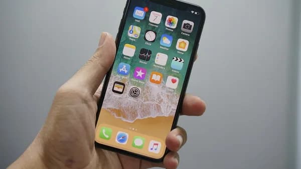
The current iOS 26 setup gives users one main systemwide Liquid Glass choice in Settings ⇾ Display & Brightness ⇾ Liquid Glass:
| iOS 26 Liquid Glass option | What it does |
|---|---|
| Clear | Gives Liquid Glass its full transparent effect |
| Tinted | Raises opacity and more closely resembles iOS 18 |
That is a blunt choice. The rumor points to something more granular.
What are the two Liquid Glass changes Apple is reportedly preparing?
The first rumored change is a systemwide Liquid Glass slider. Bloomberg’s Mark Gurman, cited by 9to5Mac, has reported that Apple had already worked on this idea during iOS 26 development.
“During development of iOS 26, Apple had been working on a systemwide slider that would allow users to finely control the level of the glass effect. The company was able to implement this feature for the clock on the lock screen but ran into engineering challenges when trying to extend it across the entire system — including app folders, the home screen and navigation bars.”
That quote is the core of the story. Apple reportedly had the concept, shipped part of it for the lock screen clock, but could not make it work cleanly across the whole interface.
The second change is broader but less specific: Gurman has reported that Liquid Glass will get “tweaks” in iOS 27, but not another redesign on the scale of its introduction.
“Apple also is planning some tweaks to the interface, though nothing as extensive as last year’s Liquid Glass introduction.”
He also framed the process as a long refinement cycle:
”I expect years of gradual improvements — much like what Apple went through following the introduction of iOS 7.”
So the rumor is not “Apple is abandoning Liquid Glass.” It is closer to: Apple may be trying to make Liquid Glass more adjustable, more consistent, and less dependent on a binary Clear-versus-Tinted choice.
Why does a slider matter more than another visual preset?
A slider would change the nature of the feature.
A preset says: pick Apple’s preferred transparent version or Apple’s more opaque fallback. A slider says: tune the interface until it works for your eyes, your wallpaper, your apps, and your tolerance for visual layering.
That matters across several everyday surfaces:
- App folders: Transparency can affect how quickly users separate icons from background imagery.
- Home screen: Glass effects can compete with wallpapers, widgets, and app labels.
- Navigation bars: If controls sit over shifting content, contrast becomes a usability issue, not just a style choice.
- System menus: Readability depends on stable layering and predictable contrast.
MLXIO analysis: The reported slider looks less like a personalization feature and more like a pressure valve. It would let Apple keep Liquid Glass as the default design direction while giving users a way to reduce the parts they find distracting.
That would fit with a broader iOS 27 cycle that is also expected to include major AI questions. The design rumors sit alongside Apple’s reported Siri work, which we covered in iOS 27 Siri Leak Reveals Apple’s AI Power Grab on iPhone. If both tracks land at WWDC, Apple will be selling two different kinds of change: one visual, one behavioral.
How much of this design story is really about engineering rather than taste?
The slider rumor is easy to discuss as a design debate. But Gurman’s reported explanation makes the harder issue technical.
Apple could make the control work for the lock screen clock. The challenge was extending it across app folders, the home screen, and navigation bars. Those are not static surfaces. They sit across different backgrounds, app states, animations, and content layers.
That means a systemwide Liquid Glass slider would need to preserve legibility while changing transparency and contrast across many interface contexts. If it fails, the user does not blame an abstract design system. They blame the app, the screen, or the phone.
The hard numbers in the supplied source are limited, and that matters. We have June 8 as the unveiling date. We have two current iOS 26 styles: Clear and Tinted. We have a reported feature Apple attempted during iOS 26 development. We do not have verified adoption rates, active iPhone install-base figures, App Store counts, or developer revenue data in the supplied material.
So the responsible read is narrower: even without scale metrics, these are high-frequency interface surfaces. If Apple changes them, every iOS 27 user who upgrades will encounter the result repeatedly.
For readers tracking Apple’s software cadence before WWDC, our earlier coverage of iOS 26.6 Public Beta Reveals Apple's Cleanup Bet Before WWDC is useful context for how much attention pre-release builds can put on polish before the next major version arrives.
Who has the hardest job if Liquid Glass keeps changing?
Different groups will judge iOS 27’s Liquid Glass work by different standards.
Users will likely judge it by feel. Can they read controls faster? Do menus look calmer? Does the interface feel familiar enough, even if it looks newer? Does Clear still feel too transparent, or does Tinted still feel too heavy?
Developers will care about rules. If Apple changes system materials, navigation behavior, and visual layering, app teams need predictable guidance. A refined Liquid Glass system could force interface audits: icons, controls, backgrounds, contrast, and how custom app chrome sits against Apple’s own components.
Accessibility-focused users and advocates will focus on contrast, transparency, motion, and legibility. A slider could help if it gives enough control. It could disappoint if it only adjusts the surface effect without solving deeper readability problems.
Apple has the narrowest path. It needs Liquid Glass to remain recognizable as a modern iPhone design language, but it cannot let the visual treatment make the system feel less direct. That is the trade-off: preserve the premium look without making basic controls feel harder to reach.
9to5Mac’s Ryan Christoffel points to one concrete friction point from his own use: the MiniPlayer in Music and Podcasts, which he says can shrink in a way that makes key controls inaccessible unless the navigation bar is tapped to reset. That is one writer’s experience, not a confirmed systemwide issue, but it illustrates the kind of practical UX detail that can define whether a redesign feels polished.
Will June 8 show refinement, retreat, or another year of unfinished edges?
Apple is likely to present any iOS 27 Liquid Glass changes as evolution, not retreat. The source material supports that reading: the reported changes are a slider and “tweaks,” not a replacement.
The strongest evidence will not be the keynote language alone. It will come from Apple’s app demos, developer sessions, Human Interface Guidelines updates, and early beta behavior. If the slider appears and works across folders, the home screen, and navigation bars, the rumor becomes a meaningful usability shift. If the tweaks are mostly cosmetic, Liquid Glass remains Apple’s long refinement project.
The watch item is simple: whether iOS 27 gives users real control over transparency and contrast, or merely adds polish around the edges. The former would show Apple turning Liquid Glass into a flexible interface foundation. The latter would suggest the hardest Liquid Glass problems still need more than one annual update to solve.
Key Takeaways
- Apple may shift Liquid Glass from a fixed design choice to a more adjustable user setting.
- Greater control over transparency and opacity could improve readability and reduce visual fatigue.
- The rumored slider suggests Apple is responding to usability concerns without abandoning the Liquid Glass design.