Data visualization plays a pivotal role in modern scientific research, enabling researchers to distill complex datasets into clear, actionable insights. With the ever-growing volume and complexity of scientific data in 2026, choosing the right platform is more critical than ever. Selecting a tool with the right features not only enhances analysis but also ensures your findings are communicated with clarity and impact. This guide, grounded in the latest research and platform reviews, details the 10 essential features data visualization tools for science must have—empowering you to make informed decisions for your research workflow.
Introduction: Why Features Matter in Scientific Visualization
Scientific data is notoriously complex, often encompassing large volumes, diverse types, and intricate relationships. According to Scaler’s comprehensive review of top platforms in 2026, data visualization tools are instrumental in transforming raw scientific data into intuitive formats—charts, graphs, dashboards, and maps—that illuminate hidden patterns and trends. But not all tools are created equal. The features you prioritize can determine how effectively you extract, interpret, and present your data.
"The best data visualization tools excel in several key areas. They put the needs of their users first, providing user-friendly interfaces and efficient workflows that appeal to both novice and expert data users."
— Scaler, 2026
For scientific researchers, the right features mean faster discovery, more robust analysis, and more compelling communication in papers and presentations. Below, we explore the 10 critical features you should prioritize.
Feature 1: Support for Complex Scientific Data Types
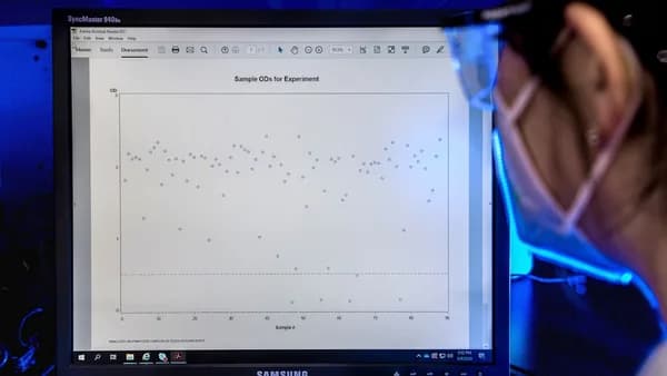
Scientific research often involves more than straightforward numerical tables. Datasets may include time series, geospatial coordinates, genetic sequences, or multidimensional arrays. A visualization tool’s ability to handle these formats is fundamental.
Why This Matters
- Scientific Rigor: Accurate representation of specialized data types prevents misinterpretation.
- Versatility: Enables a broader range of research applications—from genomics to climate modeling.
What to Look For
- Rich Visualization Libraries: Tools like Tableau offer an extensive selection of charts, graphs, and maps, supporting diverse scientific data.
- Data Preparation Tools: Built-in functions for cleaning and blending data from multiple sources (e.g., Tableau’s data blending capabilities) help ensure consistency.
- AI-Driven Recognition: Modern AI tools can recognize and process a range of data types, automating chart suggestions and error fixing (CognitiveFuture.ai).
"AI supports analysts and non-technical staff alike. It recognizes data types, fixes errors, and suggests relevant visuals."
— Cognitive Future, 2026
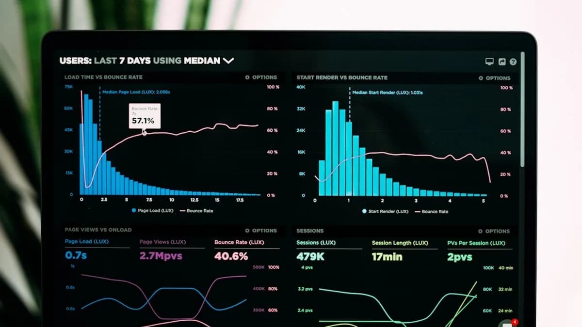
Feature 2: Interactive and Dynamic Visualizations
Static visualizations can only go so far. Interactive dashboards are now standard in top tools, allowing researchers and audiences to drill down, filter, and explore data in real-time.
Scientific Benefits
- Deeper Exploration: Enables users to uncover trends and anomalies not visible in static views.
- Improved Communication: Audiences can interact with results during presentations or in published dashboards.
Top Tools & Examples
| Tool | Interactive Features |
|---|---|
| Tableau | Drill-down, filters, dynamic dashboards |
| Power BI | Natural language queries, dashboard interactivity |
| Databox | Real-time updates, multi-source drill-down |
- Example: In Tableau, interactive dashboards let users filter results and explore subsets, crucial for hypothesis testing and subgroup analysis.
Feature 3: Customization and Flexibility
Scientific research often requires visualizations that adhere to specific publication standards or institutional branding. The ability to customize charts—down to color schemes, fonts, and interactive elements—can be essential.
Customization Features to Seek
- Color and Font Control: Adjust for accessibility or journal requirements.
- Custom Chart Types: Not just bar and line charts, but also specialty plots (scatter, network, heatmaps, etc.).
- Brand Integration: Some AI-focused platforms like Beautiful.ai offer smart templates and brand kits for polished presentations.
"Users can customize interactive elements, colour schemes, fonts, and other aspects of their visualizations to meet specific requirements, all while maintaining a polished and unified appearance."
— Scaler, 2026
Feature 4: Integration with Scientific Computing Environments
Scientific workflows rarely exist in isolation. Integration with platforms like Python, R, SQL, and cloud data warehouses streamlines analysis and avoids data silos.
Why Integration Is Essential
- Seamless Workflow: Move data directly from analysis scripts to visualization without manual exports.
- Reproducibility: Maintain links between raw data and visual outputs.
Leading Integration Capabilities
| Tool | Key Integrations |
|---|---|
| Tableau | 70+ connectors, supports cloud databases |
| Power BI | Microsoft suite, 100s of data connectors |
| Databox | 130+ source connectors for aggregating KPIs |
| AI Tools | Integration with SQL, APIs, cloud platforms |
- Many tools in 2026 offer direct connectors to popular scientific data sources and support API-based automation for advanced users.
Feature 5: High-Quality Export Options for Publications
Publishing in journals or presenting at conferences requires visuals of the highest quality. Export options—especially for vector graphics—are non-negotiable for scientific communication.
What to Prioritize
- High-Resolution & Vector Export: Ensure charts remain crisp in print and digital formats.
- Multiple Formats: Support for PNG, SVG, PDF, and interactive HTML exports.
- Accessibility: Ability to add alt text and descriptive labels for readers with disabilities.
| Platform | Export Options |
|---|---|
| Tableau | High-res images, interactive web dashboards |
| Google Looker Studio | Free dashboards, easy sharing, image exports |
| Beautiful.ai | Slide decks, export to PDF and PPTX |
| Visme | Infographics, images, and document exports |
- Note: Free platforms like Tableau Public allow sharing but all data becomes public—a critical consideration for sensitive or unpublished scientific research (CognitiveFuture.ai).
Feature 6: Scalability for Large Datasets
Scientific data can reach millions of rows. Not all visualization platforms are equipped to handle this scale without lag or crashes.
Key Scalability Features
- Efficient Data Processing: Sophisticated algorithms ensure smooth performance even with large datasets.
- Cloud & On-Premise Support: Integration with Azure, AWS, Google Cloud, and on-prem databases is common in enterprise-grade tools.
- Enterprise Readiness: Tools like Power BI, Qlik Sense, and IBM Cognos Analytics are noted for their ability to process millions of rows (CognitiveFuture.ai).
| Tool | Dataset Capacity | Notes |
|---|---|---|
| Power BI | Enterprise-scale, millions of rows | Strong governance, compliance |
| Tableau | Large datasets supported | Responsive dashboards |
| Google Looker Studio | Small datasets best | Free, limited scalability |
"Free tools such as Google Looker Studio or Tableau Public are useful for small datasets but break down with large volumes. Enterprises depend on Power BI, Qlik Sense, or IBM Cognos Analytics to process millions of rows at scale."
— Cognitive Future, 2026
Feature 7: User-Friendly Interface and Accessibility
Not every scientist is a coding expert. Tools with drag-and-drop interfaces, clear menus, and robust tutorials lower the barrier to powerful data exploration.
What Makes a Tool User-Friendly?
- Intuitive Workflows: Drag-and-drop chart building, clear navigation.
- Guided Analytics: Tutorials, tooltips, and learning resources.
- Accessibility Features: Keyboard navigation, screen reader compatibility.
| Tool | Ease of Use |
|---|---|
| Tableau | Intuitive, supports non-technical users |
| Venngage | Designed for ease, non-coders |
| ChartGPT | Text-to-chart for ultra-fast visuals |
| Beautiful.ai | Smart templates auto-adjust for content |
- AI-driven platforms now offer natural language queries: type a question, get a chart—no code required (see Power BI with Copilot).
Feature 8: Collaboration and Sharing Capabilities
Science is a collaborative enterprise. The ability to share dashboards, co-edit visualizations, or broadcast findings is crucial for teams, classrooms, and consortia.
Collaboration Features
- Real-Time Co-Editing: Multiple users work simultaneously.
- Permission Controls: Share with specific users or groups.
- Web-Based Dashboards: Publish interactive dashboards accessible from anywhere.
| Tool | Collaboration Features |
|---|---|
| Tableau | Share dashboards, web publishing |
| Google Looker Studio | Free sharing, Google integrations |
| Databox | Multi-user dashboards, real-time updates |
| Beautiful.ai | Collaboration on slide decks |
"Sharing and collaboration features for visualizations, customization options to fit specific requirements or branding, and integration with other business intelligence and data analysis tools are common features."
— Scaler, 2026
Feature 9: Extensibility through Plugins or APIs
Scientific workflows are dynamic. The ability to extend a visualization platform—via plugins, APIs, or scripting—ensures your tool grows with your research needs.
Extensibility in Action
- APIs for Automation: Connect with other platforms, automate repetitive tasks.
- Plugin Ecosystem: Add custom chart types or analysis functions.
- Scripting Support: Some tools integrate with Python or R for advanced customization.
| Tool | Extensibility Mechanisms |
|---|---|
| Tableau | API access, custom extensions |
| Databox | 130+ source connectors, API support |
| Power BI | Supports custom visuals, scripting |
- Platforms with strong extensibility are future-proof, adapting as new data types or analytical methods emerge.
Feature 10: Governance, Compliance, and Security
Especially in fields like healthcare, finance, or government-funded research, data governance and compliance cannot be an afterthought.
Compliance Features to Consider
- Audit Trails: Track changes and data lineage.
- Certifications: Support for HIPAA, GDPR, SOC 2, etc.
- Explainable AI: For tools offering predictive analytics, transparency in model decisions is vital.
| Tool | Compliance Features |
|---|---|
| Power BI | Strongest in governance, audit trails |
| IBM Cognos Analytics | Compliance certifications, transparency |
| Tableau | Enterprise data security options |
"Choose tools that provide audit trails, explainable AI, and certifications such as HIPAA, GDPR, or SOC 2. Power BI and IBM Cognos are among the strongest in governance."
— Cognitive Future, 2026
FAQ: Essential Features in Data Visualization Tools for Science
Q1: Which data visualization tools are best for handling large scientific datasets?
A: According to CognitiveFuture.ai, Power BI, Qlik Sense, and IBM Cognos Analytics are well-suited for processing millions of rows and are preferred by enterprises for large-scale scientific data.
Q2: Are there free data visualization tools suitable for scientific research?
A: Google Looker Studio and Tableau Public are free options. However, they are best for small datasets, and Tableau Public requires that all data be made public, which may not suit sensitive scientific work.
Q3: Why is integration with scientific computing environments important?
A: Integration with platforms like SQL, Python, and cloud databases streamlines workflows, supports reproducibility, and eliminates manual data exports (Scaler.com, CognitiveFuture.ai).
Q4: How do AI features improve scientific data visualization?
A: AI features—such as natural language queries and automated chart suggestions—make it faster for researchers to generate and interpret charts, especially for non-technical users.
Q5: What export options should I look for to prepare figures for publication?
A: Look for tools that offer high-resolution and vector exports (PNG, SVG, PDF), as well as interactive HTML outputs for supplementary materials (Scaler.com).
Q6: How important is user interface design for scientific visualization tools?
A: A user-friendly interface lowers the barrier to entry, enabling both technical and non-technical users to create sophisticated visuals and focus on research rather than tool mastery.
Bottom Line
The right features in data visualization tools are the difference between discovering insights and getting lost in complexity. For scientific researchers in 2026, the most essential features are:
- Robust support for complex and large-scale scientific datasets
- Interactive, customizable, and publication-friendly visualizations
- Seamless integration with analysis environments and collaboration tools
- Extensibility, compliance, and governance for secure, scalable science
By focusing on these features, you'll ensure your scientific data is not only analyzed efficiently but communicated with maximum impact—enabling discoveries that move your field forward. Always consult the latest platform documentation and reviews, as capabilities and compliance standards continue to evolve in this fast-moving space.